Contemplating Failure Part One

Screech, scratch, scrape – this is the sound of the soap box being dragged out again. For years I’ve been a lonely voice for digitally inclusive practice. Advocating the TechdDis Accessibility Essential series for making electronic documents more readable  http://www.jisctechdis.ac.uk/techdis/resources/ae  Supporting the principles of inclusive practice as improving access for all. In the beginning I’d be encouraged by all the ‘I never thought of that’ comments but recently I’ve begun to feel a failure – because nothing’s changed.

Being resilient is what matters. Equality of access to communication and information technologies matters. I’ve tried to adapt. One of the learning outcomes of the new Teaching and Learning in a Digital Age online course (TELEDAPG http://www.lincoln.ac.uk/home/cerd/teaching/teachingpractice/) is

‘Reflect on and demonstrate a critical awareness of inclusive practice on relation to inline teaching and learning resources, communication and collaborative working with and between students.’

Here is an opportunity to give the soapbox centre stage on a validated teacher education programme. My phd is moving towards the inclusive practice aspect of digital literacies and scholarship with the opportunity to develop a participatory action research project on, in and around the subject of digital inclusion.

But on the outside nothing’s changed.

The editorial from the Journal Research in Learning Technology’s special edition on digital inclusion (Vol 20 2012 available free online http://www.researchinlearningtechnology.net/index.php/rlt/issue/view/1432) starts optimistically. It identifies how ‘current digital inclusion research has failed to produce a detailed critique of what constitutes empowering support from educational institutions and their staff’. How the ‘lack of open and reflexive accounts of practice’ is hindering identification and understanding of the ‘essential empowering practices’ which are so necessary for challenging  the prejudice, stereotypes and risk-aversiveness – all of which contributes to digital exclusion. Here is the language of my sessions with staff and students on the values and ethics of a digital society but the ultimately the Journal only points out old problems and suggesting new solutions – calling for a ‘bolder approach’ by policy makers and funding agencies – precisely because so far nothing has changed!

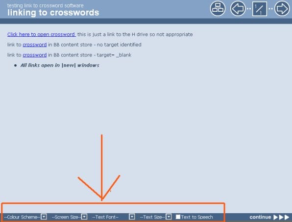
The reason for this blog is the UL HR elearning packages. It got off to a bad start with the image on the Portal page https://portal.lincoln.ac.uk/C11/C0/Online%20Training/default.aspx Here is an example about nothing changing. Text over images is never good practice – especially when advertising ‘e-learning!

example of text over an image in a poster


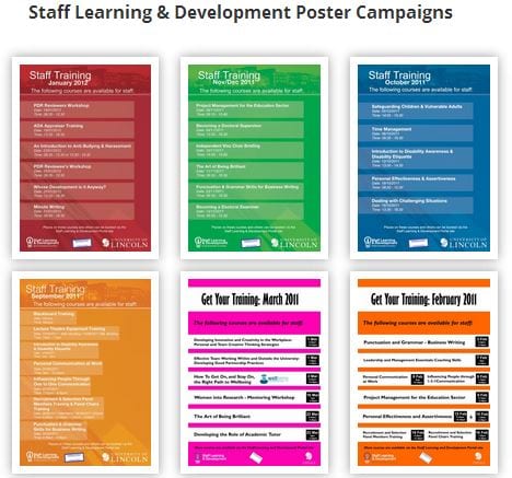
Looking at the Staff Learning and Development Poster page http://posters.lincoln.ac.uk/group/sld it seems this one slipped through – or looking at the dates on the poster archive page – may be the sign of things to come.

examples of poster design

Could I suggest the use fo text over images quietly slips out again or the new designer visits http://odi.dwp.gov.uk/inclusive-communications/channels/publishing.php for some useful guidance on creating accessible posters.

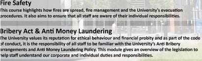
My sense of failure was heightened with the new e-learning package Bribery Act &/and Anti Money Laundering (I hate ampersands!) Faced with the question of taking time to highlight the issues or ignoring them – I decided to take time out to climb on the lonely soapbox and register another solitary protest.

See Contemplating Failure Part Two…https://suewatling.blogs.lincoln.ac.uk/2013/08/01/contemplating-failure-part-two/

Testing Xertes2

To say I’m disappointed with Xertes 2 is an understatement 🙁 It used to be up-front accessible – you could change the text size, colour, background etc to suit your own requirements. Xertes original accessibility toolbar

Xertes 2 has lost this. I’ve been told this is now html5 rather than Flash but the Tooltip function on the images isn’t working – not is the magnifier – at least, not in Chrome and I haven’t seen any browser preference specified.   whether I select Default, Full Screen, or Fit Window, the size remains 800 x 600 – unless I alter the Embed Code (see second example).  I may need to experiment more with sizing when creating content –  I worry this is another example of the invisibility of digital divides and prevalence of the tripartite MEE Model of computer access; Mouse, Eyes, Ears. Accessibility features need to be visible and at first sight this looks like a loss rather than gain.

Great day… if only the media would report on it

Great day for digital inclusion – or it would be if only the media would report on it. Neil Lewis Chief Executive of AbilityNet has highlighted the need for addressing inclusion  because of the government’s ‘digital by default’ campaign. I’ve searched on the BBC, Guardian, Telegraph and even the Daily Mail websites but the news doesn’t seem to got there yet. (incidently the Daily Mail returns no instances of AbilityNet which suggests it has never referred to the issue of digital exclusion – shame on you!)

This lack of media awareness is critical. The government’s intention for access to information and delivery of services to be ‘digital by default’ is simply not getting enough publicity;  in particular with regard to those 8-9 million citizens the government has identified as digitally excluded.

How is the population being told of the move towards an online welfare state? 

How will they find out about the plans to merge all benefits into a single Universal Credit to be applied for, awarded and managed online – unless the media pick it up and run with it?

The government is building a new computer system for this in spite of the failure of the NHS IT project the damming evidence in the System Error report which suggests ‘digital by default’ has all the potential for creating a new digital divide, one which will affect some of the most marginalised sections of society.

If you are digitally excluded you are invisible by default. As the platforms for discussion and debate become increasingly digital so those without access are being denied participation. Last week I spoke to a local group of webdevelopers, and yesterday to a group of Year 1 Social Work students, about the social impact of a digital society. We have to keep chipping away at the mountain of invisibility in order to surface these issues. Social media is one of the best places to begin.  Blogging, Tweeting, Facebooking – we need to get the message out there so those who have the power to make a difference can start to do so.

Only pairing ‘usability’ with ‘diversity’ will narrow digital divides

“Don’t only do accessibility testing with content; do usability testing with users with disabilities.” I picked up this Tweet via Nomensa and on the surface the link looked interesting. The principles are great. Don’t adopt an accessibility tick box approach to online content, and rely on automated code checkers, use real people; in particular those who are web users rather than web designers or developers. It’s not rocket science or rocket surgery as described by Steve Krug  author of Rocket Surgery Made Easy: The Do-It-Yourself Guide to Finding and Fixing Usability Problems.

However, on closer examination, the word disabilities is missing from the original source materials, as are assistive technologies, screen readers, impairment or sight loss. Neither the 23 minute video nor the sample chapter mention disability. I think Nomensa added the word because it is integral to their philosophies but in doing so they’ve misrepresented the core message of the book. Steve Krug’s focus is on too narrow a range of access criteria. He is assuming the user is a mouse user and can see the screen.

The concept of usability testing deserves recognition, but the concept of the user has to be broadened to include – in Nomensa’s words – users with disabilities – or in my words – users disabled by society; in particular one which doesn’t recognise a broad enough range of diversity or difference. This failure to look outside the box is the stuff of which digital divides are constructed. ‘Test User Usability’  (TUU? too? Two? the possibilities for a neat acronym are endless) should be a stock mantra for the web world. But the concept of ‘Users’ must representative and has to include everyone if the true meaning of accessibiltity is to be achieved.

captcha by golly wow – another boob by the beeb

Captchas have always been exclusive; firstly it took time to convince  designers an alternative to the visual code was necessary and secondly when audio options were finally provided they were next to useless. If you haven’t tried an audio captcha then you should. They are typical of the tokenistic attitudes which underlie the majority of web design and development. I don’t know what’s worse – content provided in a single fixed format or an alternative version which doesn’t work.

The BBC has come up with the worst alternative yet. Try emailing an article (I tried with an article about pulling the plug on the NHS e-records system after 9 years of failures – I thought the synchronicity was apt!)  To complete the email link process you need to use a captcha. When you select the listen option a QuickTime file opens and initially it sounds good; for once you can actually make out what is being said – but once you’ve listened you realise file has taken over the window with no way of return to the original page where the captcha was in the first place. Nice one BBC. Did you not think to try it out on anyone first?

blurry hell…

I’ve got restricted vision again and ‘seeing’ the Internet differently. Tokenism, surface allegiance to accessibility legislation, is common. My pet hates include those little ‘A’s increasing in size but not to any useful extent; clicking them isn’t as easy as you might think; they are small, and where they only increase the text frame navigation and other peripheral content remains the same.

I can change my Browser settings to Largest and increase everything that’s scalable but this highlights the amount of content that isn’t. More frustration as text gets cut off or wraps on top of itself.

magnified text cut off magnified text over wrapping

I need to re-set to Largest when I change sites and incidently, Largest isn’t Large enough. I know there’s the Ctrl and mouse wheel trick that zooms in and that’s how I’m operating but it takes two hands and a degree of manual dexterity, not to mention a mouse with a wheel and knowing about it in the first place! Without screen magnifying software, nothing affects the size of the menu bars and buttons. The brain tries to adjust but the combination of large and original text is difficult to interpret especially with menus such as Save and its  drop down lists of options. The contrast is marked and the original text size appears even more tiny. Headaches and additional eye strain is never far away.

Onto my blog. With Browser set to Largest I find my posted text isn’t responding and I need the mouse trick. The main Dashboard then becomes a touch problematic as it appears very wide. I have to scroll or arrow backawards and forwards from left to right to see it all. The drop down menus have become separated horizontally from each other. I can’t seem to get into them with keyboard commands, making it quite a fun game to try and jump across the gap to hit the Dashboard for my blog.

blog dashboard

Adding images is a bit of a nightmare; zoomed to a workable size the menu gets stuck and becomes unusable for example the image below shows how I can’t scroll down any further.

insert graphic menu on zoom

As you can see I made it but the whole process has taken much longer and is more complex and instead of enjoying working online it’s frustrating. I’ve achieved far less than I normally would have done in the hour and doing less  causes additional problems.  I’m currently looking at Dragon Naturally Speaking for times like this; I think it would be useful on lots of different levels so watch this space – if you can.

Guide Cats for the Blind

Good publicity for Google  who are rolling out machine-generated captions on 13 of their channels including YouTube. Key phrases such as ‘The software engineer behind the technology, Ken Harrenstien, is deaf’ and ‘Vint Cerf, vice president at Google, is ….hard of hearing’ emphasise how there’s no one better to create an accessible internet than those who encounter the most barriers. Example Victor Tsaran, Yahoo accessibility engineer, seen on this video explaining how he screen reads his computer  Still no captions though.

On the subject of accessibility I’ve been reminded this week of two code checkers which offer comprehensive overhauls of your html. The FAE web accessibility checker and HERA . Also this week I’ve been helped out again by the British Computer Association for the Blind.  Incidently, if you haven’t come across the BCAB Guide Cats for the Blind cd series based on the musings of Les Barker, and if traditional humour is your thing, then give them a try.

I posted earlier this week about the ‘blindingly good’ WordPress site created by a VI blogger; an example of the opportunities the Internet provides for communication and access to information especially when your life gets limited by lack of sight. Digital data can, in the words of the BBC charter, inform, educate and entertain and has the potential do so much more. Equity of access should be a prime motivator to ensure no one gets left behind.  If the big-name-players with online presence like Google can start making alternative versions appear as second nature that’s a giant step forward. Amazon, Tesco, M&S and the rest take note.

one web for all…

I’ve got mixed feelings about the SimplicITy computer with its six-button desktop aimed at ‘people aged over 60 who are unfamiliar with PCs and the internet’.  Part of me thinks what a great idea – not everyone can afford a Mac and the Windows OS has become so (unnecessarily?) complex. But what would the response be if the target audience were those classified as disabled or from a named country, class or culture. In an environment where everyday language is subject to the stringent tests to determine its political correctness, then it must be technically ageist to provide a product that implies those over 60 need something ‘simple’.

Regarding current website design – while it is far from perfect and I am continually frustrated by its inaccessibility – the direction remains ‘one web for all’. While some webs may be developed with a specific group in mind – e.g. high contrast/low image for the visually impaired – then this doesn’t deny access to anyone else. I wonder if a commercial move towards the provision of customised interfaces designed for specific groups in mind is beneficial to web equity or not. Shouldn’t we be working towards one web for all and one set of web skills for all too?

e-books

If you’ve ever tried to use an e-book you’ll know there are serious limitations; you need a reader, preferably portable; you can’t easily flick through the pages to go back to a specific sentence or idea, you can’t annotate the pages. E-books are increasingly being adopted across the sector and hyped as a cost effective solution to issues of space and availability. But let’s not forget that e-books are a visual medium and increasing digitisation of text is also increasing the digital divide and putting in place yet more barriers to participation.

Under the DDA  public bodies are meant to enusre reasonable adjustments (so those with disabilities are not discriminated against compared to those without the same disability) in terms of access to services including libraries and information resources. But academic e-book publishers have no such requirements. As libraries increase their subscriptions to electronic resources so they are moving away from their duty to ensure equality. This issue was raised in a recent post on the JISC Mail Disabilities and Technology forum for Tech-Dis  [TECH-DIS@JISCMAIL.AC.UK] where Simon Ball, Senior TechDis Advisor, describes improving the accessibility of ‘e-book and e-journal delivery software’ as a ‘priority area’.  With no disrespect to TechDis, the words ‘horse’, ‘ stable’ and ‘door’ inevitably  come to mind. It’s good to see that they are working directly with the RNIB on this. Rapid adoption of e-books across the sector reinforces the invisibility of accessibility legislation and how addressing the issues continues to be a ‘bolt-on’ exercise rather than integral to new developments.

As a society we seem to be increasingly failing our more vulnerable members. The recent statement by the PM (following the  publication of  the Digital Britain report), that that a fast internet connection is now seen by most of the public as “an essential service, as indispensable as electricity, gas and water”  and the proposal to tax telephone lines to provide it, is a classic example of running before walking. Weakness in provision of the fundamentals is then compounded by public institutions such as the British Library whose digitisation of newspapers project has resulted in commercial ‘pay-as-you-go’ access to the nations history. Instead of climbing up towards greater integration and awareness of the need to cater for diversity, the needs of the socially vulnerable seem to be sliding back down into invisibility.