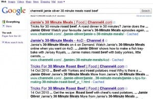
Screen reader software allegedly offers an alternative way to browse the Internet. It’s not entirely their fault that using them is so frustrating. If you can’t see the screen the Internet remains largely inaccessible. Still. After years of Web Accessibility initiatives and standards. After a decade of UK Disability Discrimination legislation. If you’re visually impaired then tough. Imagine you are new to the Internet. You search in your Browser for a recipe because the TV programme read out the website address (and blind people do cook). You get the page below (click on images to enlarge them).
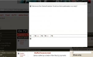
The fun begins. There are15 links to go through until you reach the first relevant URL; these include reading out your search criteria and the word Search. But you’ve just done that. Why would you want to do it again? It’s getting confusing. And it doesn’t get any better. Here’s the relevant Channel four page.
Up has popped a box. You don’t know this because you can’t see the screen. You’re being asked to participate in a study. You don’t understand what the study is about because all the relevant information is in the graphic. You’re stuck. You can’t escape (even with the Esc key) so you give up – and find something less frustrating to do instead.
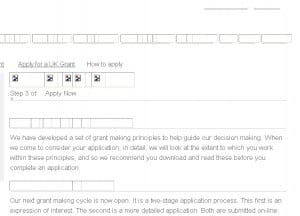
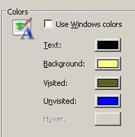
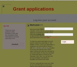
That was yesterday. Today I’m looking at the Comic Relief Grant Application web pages. I’ve got my graphics turned off because I’m testing the effectiveness of poor ALT text on BBC News. I’ve got my Browser Text size set at large because my vision is impaired. The first thing I notice is that the links are graphics and don’t all have ALT text. The headings are also graphics with no ALT text. Unsurprisingly the graphics themselves have no ALT text. I’m finding the grey on white text difficult. My browser is set to display black on yellow but the website is not allowing me this flexibility.
At the bottom on the page I find the link to Apply and am taken somewhere even more inaccessible. The text is fixed size and too small, the form boxes and instructions overlap the content and the colour contrast is poor.
I also give up and find something less frustrating to do instead.
