It began in a small Yorkshire town with a 30 inch monitor and large screen magnification. The intention was to register with the Tesco Online Shopping site The expectation was half an hour maximum to work alongside Marian who has limited vision and is new to using the Internet.
Step 1 the registration process: enter the email address, postcode and clubcard number. We’re using the clubcard number on a Tesco.com card and will be coming back to this later. At this point I would like to say to Tesco that the link entitled ‘Need Help Registering’ sounds like it is offering ‘real’ help not just a couple of lines of text explaining email means enter your email address.
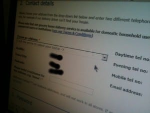
Step 2: lots of drop down menus with red asterisks marking compulsory fields. The explanation is in tiny letters at the bottom of the page. Easy to miss especially if you are new to online forms. Name ok. Address not ok. The screen should look like this.
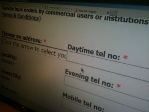
But with high magnification it looks like this
Unable to read the text, or access the drop down function at the end of the form field, this is the point where the mission to register fails – or would do without someone to provide support – which sort of misses the point of accessible online environments enabling personal independence.
There are elements of this page which I like. The text resizes well. The forms fields change colour when active. This is useful and more sites should offer it. I liked how we were sent back to the spot where content had been incorrectly entered and the form fields were clearly highlighted in red with red text instructions. However, the choice of red is unfortunate. I genuinely felt I was being told off for getting it wrong.
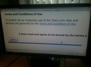
Finally we had to agree to the terms and conditions. This posed another problem. The only visible button said No.
You might not think this is a problem but it is. Firstly, how can you tell there is a Yes button hidden on the right. You can’t know what you don’t know. Plus the scroll bars are tiny and merge into the task bar with insufficient colour contrast. Both buttons closer together would be a small step which makes a big difference to the usability of this page.
Having located the button we get a message saying Sorry we are unable to process your registration. We are having a problem with the site and are hoping to fix it soon. Or words to that effect. Unfortunately, there is no way of saving the information so at some point it is all going to have to be keyed in again. It was a disappointing to say the least.
Next: Tesco Online Shopping ‘The Saga’ Part 2.


