Diversity is what makes the world go round. Or at least it should. Experiments of conformity must fail. Equality of opportunity is the fairest system; not being squeezed into narrow behaviour ranges or receiving privilege simply because you belong to a dominant group. One of the largest ever examples of discrimination is being created by the shift to digital practices and lifestyles. The design and delivery of online content increasingly privileges a narrow range of access criteria – the MEE Model – based on the assumption all users operate with a mouse, eyes and ears. This fails to reflect the diversity of ways people do use computers and access the internet but it is successfully excluding those who rely on assistive technology or non-standard methods.
Inclusive practice with digital content can directly challenge exclusive behaviours. The Web pioneers campaigned for accessibility “…if we succeed making web accessibility the norm rather than the exception, this will benefit not only the disability community but the entire population.” (Dardailler, 1997*)
I’ve been reflecting on increasingly exclusive web design and contemplating the failure of guidance from the WAI and Equality legislation; asking the question what lies at the root of exclusive digital practice? I’m coming to the conclusion its more to do with psychology than technology. We look for the quickest option, the easiest route, familiar ways of working. But as the social shift to digital ICT continues, so does the need to raise awareness of what digital exclusion looks like.
The new e-learning package Bribery Act and Anti Money Laundering on the HR Portal elearning page https://portal.lincoln.ac.uk/C11/C0/Online%20Training/default.aspx is an example of how commercial companies appear to be unaware of the principles of inclusive digital practice. Here are some examples.
The narration starts with no warning. There are no user controls to stop, pause, restart, move backwards or forwards. The narration is only on a few slides, each time starting unexpectedly. This sequential use of audio can’t be an alternative format so it’s not clear why it’s included. The audio can be toggled on or off in the Accessibility controls but you need to open the menu to find this. The volume can also be controlled here but the option is mouse operated (no sliding scale – one click for every number between 1 and 100). There is no ‘save settings’ button. The only way out of the Accessibility menu is to close the window. Close equates Exit more than Save.
The standard keyboard command Ctrl and + to increase magnification doesn’t work; it does reveal the zoom icon in the top right which runs up to 500x in digits but makes no difference to appearance. To customise appearance to preference is through line spacing and text size in the Accessibility panel. This was not successful. Images run over text
Buttons don’t resize.

Colour contrasts don’t all adapt to my choices as well as text frames not resizing.
Text boxes merge.

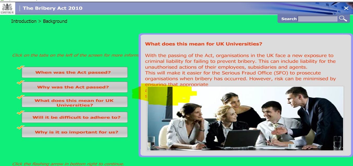
The background colour can be changed but this lost the content on certain slides offering a green screen.
There might be a clue on slide 28 which contained images and suggests the background layer may be positioned on top of the graphic layer – only a guess but something somewhere is not right.

The keyboard controls appear to be only for moving through the bottom bar buttons; not offering alternative navigation which should be standard practice.
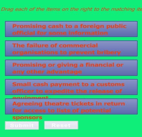
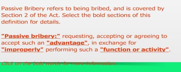
There are no alternative ways to navigate through the slides nor click on text which is bold or part of an image and links to additional information

Tab and Shift highlight essential structures but moving from slide to slide in this way is slow and laborious. Shift also brings up the Contents menu which Esc doesn’t close – only a mouse click will do. These keyboard alternatives are unrealistic for navigation. There is no information about how to access the content without a mouse.
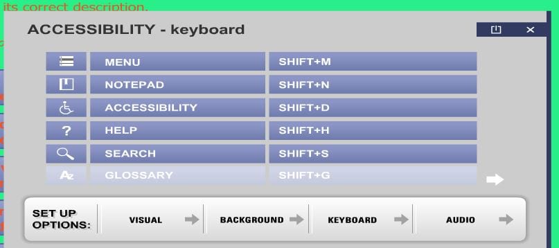
The accessibility window has an image of a wheelchair. I wonder why?

This image associates accessibility of digital content with disability and disability only with wheelchair users; neither fair nor accurate assumptions and going against the principle of inclusive practice which is achieving improved assess for all. It’s like saying transcripts are only for people with hearing difficulties – which ignores those with no speakers or headphones or who simply prefer text to audio.
There are other design issues which are questionable. External links take you into a new window with no warning and closing the window returns you to the elearning menu page – rather than the last slide.
Where a name is given as a source of further information, the name is hyperlinked to Outlook which assumes the user has Outlook installed; I don’t have Outlook on my home laptop – so without any details such as an email address or phone number there is no way of contacting the person.
The use of transitions to load pictures is reminiscent of death by PowerPoint. Slide 7 has an spelling mistake in the answer window. This suggests not only was the resource not piloted for alternative usage outside the dominant MEE model (Mouse, Eyes and Ears) it also hasn’t been proofed for errors.

I’m not responsible for this resource but it’s indicative of how inclusive practice with digital data is a dying art.
I wonder if anyone else caring about equality of digital opportunities is also contemplating failure.
Comments are closed.