The IDER (Inclusive Digital Educational Resources) Working Group meets again this week. It’s time to think about making recommendations. The process will be helped by recent agreement on the Blackboard Required Standards which include Accessibility but what will this look like in practice?
Accessibility is not a popular subject. Already there are comments about this representing more work. I’m trying to say it’s not additional – it’s more like a different way to do what’s already being done. The loss of TechDis has further diminished the status of accessible online content. The Excellence Gateway Toolkit for Accessible Learning Materials has been archived, as has the BBC My Web My Way site while the RNIB’s Web Accessibility Centre seems to have got lost, along with the University of Salford’s Skills for Access which promoted accessible multimedia. The second set of guidelines from the Web Accessibility Initiative are less intuitive than the first and British Dyslexia Association and AbilityNet appear to be the only organisations still offering specific guidance on font, colour and contrast etc. The move is towards personalisation; the idea being individual users will customise their browsers to suit their own requirements. It makes sense but content creators need to ensure this can happen for examples one of the problem areas is PDF. People like PDFs because they are uneditable and the format looks the same on all applications but locking it down makes it less flexible. You need Adobe Acrobat to make visual changes, which is not free, and using it is neither easy nor intuitive
There is also the problem of web resources which are not downloadable. I have a problem with grey text on a white background. It seems increasingly popular and I’m not sure why. The British Dyslexia Association’s advises us to use dark on light e.g. ‘Use dark coloured text on a light (not white) background’ and ‘Most users prefer dark print on a pale background.’ AbilityNet say ‘If using a light-coloured type, make sure the background colour is dark enough to provide sufficient contrast.’ BDA also say ‘Avoid white backgrounds …White can appear too dazzling.’ Yet B/W is ok for me. I can tone it down using the screen brightness. It’s grey on white which is the problem.
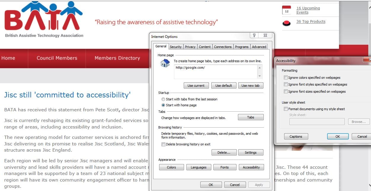
This reinforces how there’s no one size fits all solution. One answer may be to raise awareness of the diversity of ways users might want to access digital resources and support that diversity with inclusive practice guidelines while also promoting how to change browser settings. I’m not a huge fan of the DIY approach. The image below shows some of the steps needed to change text colour . There are multiple windows requiring local knowledge, for example how do you know if you need the Colours, Font or Accessibility button on the Internet Options menu and once you’ve made the change for one website, it can create inappropriate changes for others.?
I don’t know what the answer is and with the gradual dilution of sector wide support for inclusion and accessibility, I wonder if anyone does. I’ve over 20 years of experience with ICT and can still get lost online. It seems too easy an option to say appearance can be configured in your browser, or expect people to understand the need for providing alternative formats. Unless you’ve experienced the frustration of digital exclusion for yourself, persuading colleague to change behaviour is going to be a challenge. However, the proposed changes to the DSA, and the need for institutions to revisit the duty to make reasonable adjustments to the provision of information and resources, means someone has to do it and for me the IDER Working Group is in an ideal position to explore these issues and reach some workable conclusions. In the meantime, if anyone has any useful suggestions around promoting and achieving inclusive digital practice please do feel free to get in touch. All suggestions are welcome 🙂