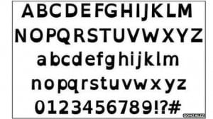
Openness has become part of the language of higher education. Open academic practice includes open educational resources, open source and open course ware; all examples of the affordances of the internet for supporting equality of access. One of the most recent additions to open opportunities for participation is OpenDyslexic. Developed by Abelardo Gonzalez, this is a free font designed to improve reading content online.
Digital data’s inherent flexibility to support a diverse range of access requirements has long been promoted. TechDis and Dyslexia Friendly Text from the British Dyslexia Association have offered a range of alternatives but there has been no one size fits all solution. OpenDyslexic attempts to overcome this. It reflects how ebook readers are making digital the choice of text for many users while also supporting the philosophy and practice of openness. The font has bottom-weighted characters, designed to reduce letter-swapping and increase the differentiation between similar-looking letters. this may improve readability not just for people with dyslexia but those with low vision might also find this font useful with large chunks of text.
OpenDyslexic can be downloaded here http://dyslexicfonts.com/downloads.php Adding the font to Chrome is one of the options (if you use Chrome) but you need to know about extensions to remove it. Only some environments allow the font change and where the default font size is 10 or under the text has a tendency to blur. There is always a technology gap between the theory and the reality and all to often those who would most benefit from the additional support are those who fall down it. OpenDyslexic is an example of a potential bridge but I think there’s still much to do with user testing and participation.
