Calling all web developers….

I’ve just been asked this question from a web developer who identifies standard arguments against accessibility as including “too expensive, and takes too long for such a small percentage of users” He then goes onto ask if I’m aware of any kind of figure regarding users who have accessibility requirements when using a computer.

Here’s my reply.

There are some contentious and deep rooted issues here about attitudes to diversity and difference (too expensive, and takes too long for such a small percentage of users????) in a digital society in particular where government is moving towards ‘digital by default’ services underpinned with the perception that communication and information technologies save time and money. Digital divides are the inevitable result if design and delivery favours a narrow range of access criteria rather than principles of inclusive practice.

With regard to users of assistive technologies, no one knows how many there are – or would be – if it were less expensive and more supported – but here are some facts and figures:

  • There are around 11 million disabled adults in the UK, this includes limiting long standing illness. This is equivalent to 20 % of the population
  • 17% people are born with a physical, sensory or cognitive impairment – 83% acquire one in later life.
  • At 2009, there are over 6.9 million or 18.3% of working age people (one in five) who are disabled
  • There are about 2 million people in the UK with significant sight loss. There are an estimated 25,000 children with sight problems.
  • It is estimated that there are almost 9 million people with hearing impairment  http://www.papworth.org.uk/downloads/disabilityfactsandfigures2010_100202152740.pdf 
  • It is estimated that 130,000 people have a stroke in the UK each year, resulting @ 67,000 deaths leaving a potential of 63,000 people with a physical, sensory or cognitive impairment. http://www.thestrokesociety.com/
  • There are 10 million people (1 in 5) living with arthritis in the UK; arthritis can cause severe restriction of movement making it difficult to use a computer.   http://www.arthritiscare.org.uk
  • Then there are issues around learning disability. Acquired Brain Injury is the largest cause of disability amongst the working age population. There are about 1.5 million – nearly 3 in 100 – in the UK who have a learning disability. Just 1 in 3 people with a learning disability take part in some form of education or training. About 200 babies are born every week with a learning disability http://www.papworth.org.uk/downloads/disabilityfactsandfigures2010_100202152740.pdf 

These figures relate specifically to ‘disability’ but I think we need to take a broader view.  Inclusive design/accessibility is not only about ‘disability’; inclusion is about accepting the full range of human diversity with respect to ability, language, culture, gender and age. Society promotes increasingly digital lifestyles and ways of working and web developers are in the unique position of being able to make a real difference – we need to ensure that difference is about ensuring equitable digital access rather than being discriminatory.

Michael Hart

Michael Hart has died. I heard this via Twitter last night but so far there appears little recognition in the news. This should be a level 1 headline. Hart founded Project Gutenberg  which is dedicated to ensuring equitable access to online content. Named after the Gutenberg Press from the late 15th century, which made possible the mass distribution of printed materials, Project Gutenberg aims to do the same with digital text. Books which no longer have copyright restrictions are digitised and made freely available in a range of formats enabling users to search, read and quote content. The project also invites users to participate. Become a Gutenberg volunteer and be sent digitised pages to proofread and check for errors. Volunteers are also invited to burn cds for people without Internet access. Project Gutenberg espouses the principles of open access while remaining focused on content rather than appearance; a philosophy we are in danger of losing in our current celebrity obsessed culture. It is a fantastic free resource; a legacy from the early days of mergence between the Internet and the World Wide Web and the founding philosophy of democratic access.

“As we move towards a highly connected world it is critical that the web be usable by anyone regardless of individual capabilities and disabilities.” (Berners Lee, 1997)

“…if we succeed making web accessibility the norm rather than the exception, this will benefit not only the disability community but the entire population.” (Dardailler, 1997).

The death of Michael Hart, founder of Project Gutenberg, is an ideal time to remember these principles. I hope Hart will be both remembered and celebrated not only as someone who recognised the potential power of digital data for democratic access, but who actually did something about it too.

project gutenberg logo

Berners Lee, T. (1997) World Wide Web Consortium (W3C) Launches Web Accessibility Initiative. WAI press release 7 April 1997. Available at http://www.w3.org.

Dardailler, D. (1997) Telematics Applications Programme TIDE Proposal. Web Accessibility Initiative (WAI) Available at http://www.w3.org.

Please read this…

Blogging again with more examples of digital exclusion – this time about the continual need to update. Many people are using computers with Windows XP and Office 2003 and there’s nothing wrong with that –  if it ain’t broke don’t fix it. But browser software is different. We are recommended to upgrade for security reasons but Microsoft are not considering users of JAWS screen reading software. JAWS is the market leader. In proficient hands it offers the potential for ‘as good as it gets’ access to the Internet; the only barrier being the design of the websites – and your browser. The latest version of JAWS is 12.0 It’s been out for some time and there’s a known incompatibility with IE9. Last week I upgraded someone to 12.0 and phoned the supplier’s support desk for the latest information – still incompatible. That’s a discrimination against users of JAWS. But it gets worse. I also upgraded someone from IE7 to IE8 because their antivirus software recommended it. This is a user of an older version of JAWS 8.0. Result? Jaws stopped working. You could get to a webpage but then got the message ‘page has no links’. Answer? Jaws 8.0 is incompatible with IE8. This is where the discrimination becomes exclusion. To upgrade from JAWS 8.0 to 12.0 costs £330. How affordable is that when you have no sight and no employment?

Access to the Internet is an integral part of our daily lifestyles and working practices. If you are isolated at home then email and websites become a vital source of communication and information. The problem is digital inclusion is related to social capital and no one cares if you are digitally excluded if you are already socially marginalised and disempowered. Assistive software should be free. The argument which web developers use to excuse their lack of attention to accessibility – it’s only for a small minority of the population – should be extended to people with sight loss – who have the most to gain from being digitally included. If it’s such a small proportion of the population then it won’t be a big deal to ensure they have the software they need to get online – will it?

captcha by golly wow – another boob by the beeb

Captchas have always been exclusive; firstly it took time to convince  designers an alternative to the visual code was necessary and secondly when audio options were finally provided they were next to useless. If you haven’t tried an audio captcha then you should. They are typical of the tokenistic attitudes which underlie the majority of web design and development. I don’t know what’s worse – content provided in a single fixed format or an alternative version which doesn’t work.

The BBC has come up with the worst alternative yet. Try emailing an article (I tried with an article about pulling the plug on the NHS e-records system after 9 years of failures – I thought the synchronicity was apt!)  To complete the email link process you need to use a captcha. When you select the listen option a QuickTime file opens and initially it sounds good; for once you can actually make out what is being said – but once you’ve listened you realise file has taken over the window with no way of return to the original page where the captcha was in the first place. Nice one BBC. Did you not think to try it out on anyone first?

exclusion by language…

I’ve been sent a link reporting on an Accessibility Hack Event at Birmingham. This is a great idea – put together the people who are interested in accessibility. We should do this at Lincoln. Here’s a few comments on the blog post.  

The affordances of digital data have never been utilised effectively – it’s the optimum opportunity for ensuring equality of digital access but too often the theory gets privileged over practice and the opening promotion video by GPII is typical:

e.g. user is recognised at public access point and now sees large print on ticket machine = one happy user  but…. magnified text requires increased screen size – other wise you need navigational devices which then mean all the information can’t be seen at once… another e.g…..back of seat monitor on aircraft customised to suit user preferences – you can hardly see (or hear) these in the first place – so increased text size is not going to assist…

The ratio between content and monitor size is so relevant but easily overlooked.  I’m working with someone with macular degeneration whose family have bought them a new widescreen Acer laptop all set up to display large tools and text. But email via Windows Live is almost unusable because the screen size doesn’t support the chosen display size. Sounds obvious but unless you’ve tried it….

The idea of providing accessibility rather than having to  adapt to a standard environment has long been a dream of Assistive Technology users. This is why I’m so interested in the idea of ‘intuitive digital data’ which knows how to adapt to the device being used or ideally can provide itself in the appropriate file format as requested – something I believe we are working towards.

A keynote speaker at the event was correct in saying accessibility should be a right for all, and whereas most people see accessibility as about disabled people, it is actually about everybody – then they spoiled it saying the aim is to deliver the best website that is ‘accessible to as many people as possible, a website that is accessible to everyone would just be text, which would be ugly’.

This second statement is both contradiction and backwards step – accessibility is not about as many people as possible – it’s about everyone full stop – and a website which is accessible to everyone does not have to be plain text – that’s the reason text-only alternatives were dropped. A fully accessible website can have pictures and multimedia and interactive forms – it just needs to include the information to be given in alternative formats,  and all content to be correctly and appropriately labeled for screen readers.

An Accessibility Hack Day is a great opportunity to bring people together to talk about important issues. It’s in the nature of digital exclusion to be invisible. But the key issue the blog post raised for me is how the language was indicative of the current cultural shift away from the social model of disability – which sees the external environment as disabling by not recognising and providing for a diversity of requirements (digital disability is an ideal example where we have the technology to ensure 100% access but all the barriers are economic, political etc) and back to the old medical model of disability which saw the reason for lack of participation as being caused by individual impairment – be that physical, sensory or cognitive. It’s concerning how the language of disability is changing with references to disabled people rather than people being disabled by society – you may think this is being pedantic – but it isn’t.

The GPII video says ‘those of us with disabilities often run into a situation where the technology doesn’t work well enough to meet our abilities’. Another presenter refers to ‘people who are severely disabled with motor neurone disease’  These are examples of language use which need to be challenged. The Social Model calls for disability to be seen as something imposed on individuals by society – motor neurone disease is an impairment – and to call someone disabled by it is an example of the old medical model in action. I worked with someone with motor neurone disease whose used a computer for years. But the disease is reducing ability to move fingers and keyboards are designed with the assumption that we will only hit one key at a time.  With a keyguard in place, the computer can be used again (although it means a laptop remains inaccessible). 

The solution lies first and foremost in the external environment where the limitations of the technology are the disabling factor. Subscribing to a social barriers model is an essential prerequisite to enabling independence and social participation – in particular with ensuriong digital inclusion.  Technology can be empowering but the problems begin when perceived solutions derive from the viewpoint of the technologist – not the user – we have to step outside of our world and into the life-world of other people in order to experience the barriers to know how best to help remove them.

Finally – the disclaimer at the end of the GPII video sort of says it all.

The contents however do not necessarily represent the policy of the funders and you should not assume endorsement by the federal government.  It would have been more encouraging if it had said Accessibility is the policy of the funders and you can assume endorsement!

What’s in a name?

Quite a lot actually.  Juliet may have said ‘That which we call a rose by any other name would smell as sweet.’* but you need to choose its substitute with care. Dogwort is the prettiest of spring flowers but would you recognise it? Exactly! Whereas everyone knows a rose even if your only experience is modern hybrids which are all colour and no scent.  

Fancy fonts are a bit like todays roses; all style and no substance. Fonts are like people; they have their own characters and personalities. The problem starts when  the font you choose says more about you than the message you want to put across. A disaster in the art of communication.  Naming is a tricky art; a conundrum which lies at the heart of marketing – how best to deliver the message succinctly and with style?

How best to name a staff development workshop where it needs to convey the message that attending is worth an hour or two of your time. I’ve developed a session which looks at working with digital data and ensuring the information we put online can be accessed by everyone, regardless of the ways in which they use their computers. It’s about recognising difference and diversity but in relation to operating within digital environments. Take-up on the sessions isn’t great. Paul Stainthorp has suggested this could be symptomatic of the lack of importance placed on accessibility, usability and access issues in general. I think Paul is right – but public institutions have a responsibility to ensure digital content follows inclusive practice guidelines. Which is why a little awareness raising is not a bad thing. But how best to get the message across?

With hindsight maybe the title Promoting Inclusive Practice with Digital Data isn’t the best of choices. I like the phrase Digital Literacy but first responses suggest it’s making the same mistakes. The meaning is clear to me but I’m not standing outside the box. I like Know your Fonts but it’s not much better – I know what I mean but how can I be sure that meaning is explicit? Maybe there isn’t a title with universal appeal. Maybe we’ve all become too set in our digital ways. I don’t yet have the answer. But you have to appreciate the subtle irony that a workshop about getting the digital message across successfully has a title which is failing to get that message across in the first place!

* Romeo and Juliet (II, ii, 1-2)

still inaccessible….after all these years….

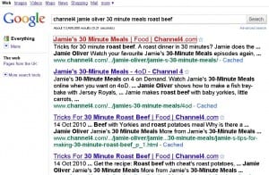
Screen reader  software allegedly offers an alternative way to browse the Internet. It’s not entirely their fault that using them is so frustrating. If you can’t see the screen the Internet remains largely inaccessible. Still. After years of Web Accessibility initiatives and standards. After a decade of UK Disability Discrimination legislation. If you’re visually impaired then tough. Imagine you are new to the Internet. You search in your Browser for a recipe because the TV programme read out the website address (and blind people do cook). You get the page below (click on images to enlarge them).

google search results page

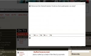
The fun begins. There are15 links to go through until you reach the first relevant URL; these include reading out your search criteria and the word Search. But you’ve just done that. Why would you want to do it again? It’s getting confusing.  And it doesn’t get any better. Here’s the relevant Channel four page.

channel 4 page

Up has popped a box. You don’t know this because you can’t see the screen.  You’re being asked to participate in a study. You don’t understand what the study is about because all the relevant information is in the graphic. You’re stuck. You can’t escape (even with the Esc key) so you give up – and find something less frustrating to do instead.

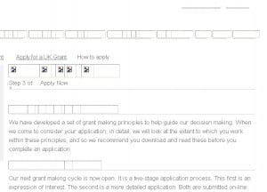
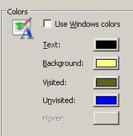
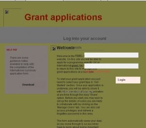
That was yesterday. Today I’m looking at the Comic Relief Grant Application web pages. I’ve got my graphics turned off because I’m testing the effectiveness of poor ALT text on BBC News. I’ve got my Browser Text size set at large because my vision is impaired.  The first thing I notice is that the links are graphics and don’t all have ALT text. The headings are also graphics with no ALT text. Unsurprisingly the graphics themselves have no ALT text. I’m finding the grey on white text difficult. My browser is set to display black on yellow but the website is not allowing me this flexibility.

comic relief grants page               internet colours menu

At the bottom on the page I find the link to Apply and am taken somewhere even more inaccessible. The text is fixed size and too small,  the form boxes and instructions overlap the content and the colour contrast is poor.

comic relief grant application page

I also give up and find something less frustrating to do  instead.

PIP2

10 quick and easy steps to inclusive practice with digital documents.

 Avoid

  1.  Text in capital letters
  2. Text in italics
  3. Underlining text (except for hyperlinks where it’s a convention)
  4. Right, Centre and Full Justification
  5. Patterned backgrounds
  6. Poor colour contrast
  7. Text over images
  8. Fancy fonts
  9. Text less than 12 pt in size
  10. PDF with no alternative version (eg Word, rtf, html etc)

Finally, Section 20 of the Single Equality Act, ‘Duty to make adjustments’ (page 24 of the act) expressly references the provision of information in accessible formats. The EQU guide to implications of this act for higher education uses the example of providing lecture hand outs only in paper format where a reasonable adjustment would be to provide lecture notes in alternative formats such as on a virtual learning environment.  Students can then access them independently and, designing them with the 10 steps above in mind, should help ensure they are accessible.

PIP1

The Equality Challenge Unit (ECU) website have produced a document  ‘Implications for Higher Education Institutions’ referring to the Single Equality Act’. They also have a useful link on their home page How can academics ensure the materials they produce are accessible for all students?

The Single Equality Act is a complex piece of legislation; there are nine areas against which it is illegal to discriminate and HEIs still have the responsibility to make ‘reasonable adjustments’ in order to ensure a disabled person is not treated less favourably than a non-disabled one. The word disabled is in itself contentious. It doesn’t make explicit that being ‘disabled’ is about society and not the individual, that being disabled is about being denied access to participation through  society’s failure to recognise sufficient categories of difference. The external social environment functions at the level of the majority or the level of the individual who is operating as the provider of ‘goods, facilities, services and public functions’.

With regard to virtual learning environments this is about the MEE Model. The person creating and uploading digital content using Mouse, Eyes and Ears and assuming everyone accessing that content is doing the same – when this might not be the case. As we head towards the start of a new academic year, it’s worth revisiting the subject of promoting inclusive practice with digital data. Look out for PIP2 following shortly 🙂

Hunt the ICT Strategy

The governments ICT strategy was launched yesterday. Maybe I was looking in the wrong places, but I expected to see a bit more publicity heralding the event. As it was I saw nothing.  Same again today. Not the BBC news, or Technology pages, no mention in the Guardian Online. So I turned to Google and eventually, after following several links to non-government pieces referring to it, I finally arrived at http://www.cabinetoffice.gov.uk/cio/ict.aspx

My point is on the one hand we have a government promoting digital inclusion and on the other it doesn’t seem to be aware of what it’s like to be digitally excluded. Having to search to find its own ICT Strategy suggests it’s not that bothered about it being found. In digital Britain, it won’t be enough to have access, it’s not even the skills and the confidence that makes the difference. It’s the format in which digital information is provided and promoted.  

 Once you get there then Write to Reply encourages audience participation and the text enlarges well – although if you were unfamiliar with the format then navigation becomes problematic. I’d like to see the statutory button called Accessibility. Even if it can’t offer anything alternative it would at least show awareness of the issues. The home page graphic has no meaningful Alt text; ‘Wordle’ doesn’t count; it means nothing if you are unfamiliar with the concept. Again, sometimes it’s what you don’t do that often says more about you that what is done.